April 2013 Market Update
The overall perception of the U.S. real estate market is almost 180 degrees different from a year ago when most analysts were focused on the size of the foreclosure inventory and how much further housing prices would decline. Now, there is a positive report almost daily on how much home prices have increased and how strong sales activity has led to very tight market conditions. Our prediction from a year ago that the market was likely to turn much faster than anyone could imagine has, not only, been realized, but also, exceeded. Our thinking at the time was based on several factors. First, the number of new homes being built had been running at historically low rates for more than five years and that there would be a significant shortage of this component of housing supply once demand returned with an improving overall economy. Second, the significant price declines in a number of important markets led to many mortgages being underwater such that the owners could not afford to sell. This reduced the normal supply of existing homes available for sale.
One of the catalysts in the current upswing has been the large investment funds purchasing REO and other distressed single family homes to rent out. As we also mentioned at that time, the economics of doing this was very compelling, particularly with very low investment returns available in the more traditional financial markets. This is still the case today even though there have been significant price increases in many of the previously distressed markets of interest.
There has been some talk of this investor demand as being artificial but we disagree. These funds have been renovating the homes which has helped improve the overall conditions of the surrounding neighborhoods. This injection of capital can only be positive since it is unlikely that homeowner buyers would have had the wherewithal to do the same. In addition, having observed a number of real estate cycles, we have noticed that, while each one may appear to be different on the surface, they all have the common thread that some type of catalyst gets them going in the first place. Once the cycle starts, a virtuous process of higher sales leads to higher prices which leads to more buyers coming into the market out of fear that they will miss out. At the same time, higher sales typically leads to a shortage of inventory available for sale except in those markets where new homes can easily be built. A unique aspect of the current real estate market environment is that it has the strong fundamental support of very low mortgage rates and historically high levels of home affordability.
We have discussed in the past a number of individual market indicators which tend to lead the cycle on both the up and down sides. One that has been especially useful is the Collateral Analytics Leading Real Estate Index (CA LREI) which is shown in Figure 1 below for the overall Los Angeles Metro. This index is based on a number of factors which include housing affordability, employment growth, home sales activity, and new building permits, to name a few. The CA LREI creates a so-called “diffusion index” from these components which effectively measures what percent are moving in a positive or negative direction at each point in time. The index values range between 0 and 100 and a “Buy Signal” is given when the index moves above 50 from below while a “Sell Signal” is given when the index moves below 50 from above. As seen, the signals have been excellent over the past 30 years with “Buy Signals” in late 1983, late 1996, and most recently in the third quarter of 2012 and “Sell Signals” in late 1990, and early 2007. Similar well-timed signals were given over the years in most other major real estate markets such as Atlanta as seen in Figure 2. One of the primary conclusions from this is that these signals typically occur years apart which suggests that the current up-cycle is in its very early stages.
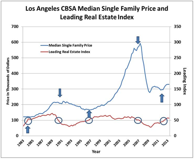 Figure 1
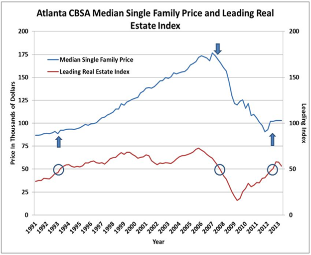 Figure 2
CBSA Winners and Losers
Each month Home Value Forecast ranks the single family home markets in the top 200 CBSAs to highlight the best and worst metros with regard to a number of leading real estate market based indicators.
The ranking system is purely objective and is based on directional trends. Each indicator is given a score based on whether the trend is positive, negative, or neutral for that series. For example, a declining trend in active listings would be positive as will be an increasing trend in average price. A composite score for each CBSA is calculated by summing the directional scores of each of its indicators. From the universe of the top 200 CBSAs, we highlight each month the CBSAs which have the highest and lowest composite scores.
The tables below show the individual market indicators which are being used to rank the CBSAs along with the most recent values and the percent changes. We have color-coded each of the indicators to help visualize whether it is moving in a positive (green) or negative (red) direction.
Top 10 CBSAs
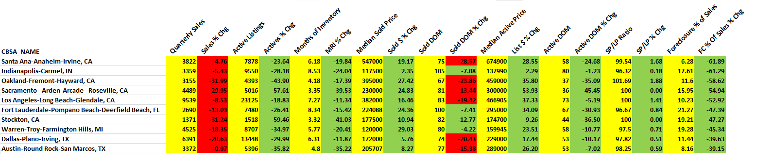
The top ranked metros in the current month include markets from all major regions of the U.S. Of particular note is that five of the top markets are in California and include not only the very important Los Angeles and Orange County (Santa Ana-Anaheim-Irvine) CBSAs, but also, the Sacramento and Stockton metros which had previously been very distressed having experienced severe price declines after their respective market peaks in 2005 and 2006. Texas is also well represented in this list by the Dallas and Austin metros. A number of other Texas markets did not make the Top 10 but are also showing very good conditions including Houston, Fort Worth, Lubbock, and San Antonio. A new entrant to the Top 10 list this month is Warren-Troy-Farmington Hills, MI. This is a market which was very hard hit in the recent recession but appears to be experiencing improving overall economic conditions. The difficult recession led to a significant decline in home prices such that this metro currently has some of the most favorable home prices and, as seen in Figure 3, one of the highest Affordability Indexes in the U.S. The result is that this is another market which has very compelling rental yields which is apparently attracting both institutional and individual single family home investors.
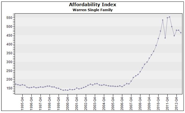 Figure 3
An interesting development which we have highlighted in recent months is that several of the top markets from late last year such as Phoenix AZ, Salt Lake City UT are no longer in the list because their year-over-year sales counts are down sharply. However, the reason for this is that sales are being constrained by a lack of inventory rather than a decrease in demand. This phenomenon is also showing up in our Top 10 list. Note that all these metros are exhibiting positive trends in all the important market indicators except sales activity. Because their active listing counts are also down sharply, the Months of Inventory Remaining values are still quite low.
Bottom 10 CBSAs
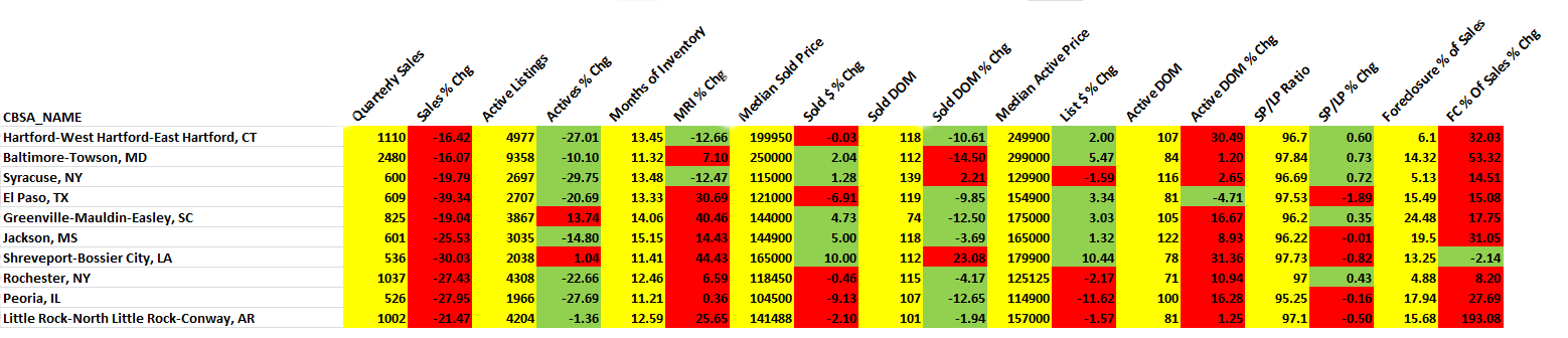
The bottom ranked metros also represent and interesting mix with two continuing to be in the upstate New York area and three is the Southeast. As seen in the table, all have double-digit Months of Inventory Remaining. However, our top and bottom ranked CBSAs are ranked on a relative basis. Thus, even the ones in the Bottom 10 list are showing a fair percentage of positive (green) trends. This is quite different from last year when the majority of the Bottom 10 markets had most (or all) of their indicators trending negative and colored red.
Our Market Condition thematic maps are a good way to visualize the more geographically granular conditions within the metros. Figure 4 below shows zip code single family rankings for the San Francisco Bay Area which includes one of our Top 10 CBSAs, Oakland-Fremont-Hayward CA. As seen, nearly all these markets are now rated “Good” or higher with several being in the “Hot” category.
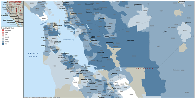 Figure 4
Figure 5 shows our Market Condition map for upstate new York to show the Bottom 10 Rochester and Syracuse CBSAs. Note that even these metros are exhibiting most of their constituent zip codes as having “Normal” conditions.
Outliers
In this month’s Outliers, we highlight the Sacramento-Arden-Arcade-Roseville, CA CBSA, which is currently in the list of the Top 10 metros. As seen in the ranking table above, all but one of the important market indicators for this CBSA are showing positive trends on a year-over-year basis including declining inventory, lower Inventory Remaining, declining market times and lower distressed sales activity to name a few.
Within this CBSA there are numerous sub-markets. On a Zip code level, one of particular interest is Zip code 95618, Davis, CA which is one of its higher priced markets.
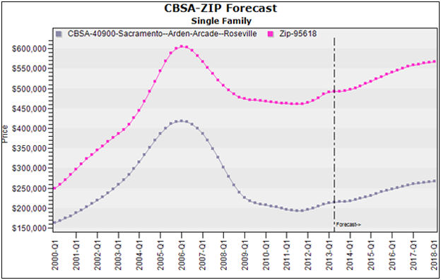 Figure 6: CBSA – Sacramento-Arden-Arcade-Roseville | ZIP 95618, Davis, CA
As seen in Figure 6, single family home prices in this Zip code have held up much better that the overall Sacramento metro since the market peak. In addition, as seen above, our home price forecast models call for this Zip code to continue to outperform the surrounding metro and move close to its previous peak levels over the next several years.
There are a number of reasons for the historical and forecasted outperformance of this Zip code which include the fact that home buyers in this Zip code have historically been better capitalized and, thus, better able to weather declines in home prices. The average loan-to-value (LTV) ratio in Zip 95618 has historically been around 75 percent compared to approximately 86 percent for the overall Sacramento-Arden-Arcade-Roseville, CA CBSA.