by Dr. Michael Sklarz and Dr. Norman Miller
Introduction
The analysis of home price risk, default and foreclosure risk, usually occurs at the individual household level and considers value, credit, income and wealth at that same level. Without dismissing the value of such individualized analysis, the neighborhood within which each household resides exhibits considerable influence over price, the uncertainty behind value estimates of price, and foreclosure rates. Here we explore the ways we might add to value and risk analysis at the neighborhood level.
A neighborhood can be thought of as a submarket located in a broader geographic area within which the typical buyer would search for alternatives to any given subject property.[1] Attributes that might be used to define a neighborhood for residential property include but are not limited to year built, living area or lot size, school district, postal carrier route, and other physical traits of the homes themselves. Postal carrier routes tend to handle physical differences in geography as natural walking barriers tend to be boundaries for neighborhoods. Appraisers and realtors define and use neighborhoods as the primary source from which comparable sales are selected.[2] Aside from value calculations, neighborhoods can provide an array of useful metrics for those concerned about both home price risk and mortgage default risk. We categorize the types of information that can be extracted from advanced neighborhood analysis in the following three dimensions:
1) Price and Attribute Dispersion
In 1988 Haurin suggested a measurement for atypicality of a property relative to its neighborhood peers.[3] The general idea was to list out the frequency of property attributes and to compare a weighted measure of how well a subject property fit into that which is most typical in a neighborhood. This same idea can be extended in several ways.
One approach is to simply look at the statistical dispersion of all properties within a neighborhood on the basis of physical attributes. In the appendix we provide a set of distributions of common physical attributes for all the houses in the United States. Naturally, these are not the standard against which any given property should be measured for judging the conformity with a given neighborhood. That requires a relative measurement.
While this does not portend whether a subject property fits into an average neighborhood, it does provide some general notion as to what is normal for the aggregate US residential housing market. Distributions of property attributes will be illustrated below as one measure of homogeneity of a neighborhood. Our hypothesis is that neighborhoods with greater physical (age, size, features) attribute heterogeneity will also have greater price dispersion and value uncertainty. Price dispersion in relative terms is most relevant so we will most often use the percentage measure relative to the mean for any given attribute as a way to standardize the data, which is the Coefficient of Variation.
Another approach is to look at the relative dispersion of sold prices within the neighborhood or the sold prices per square foot of living area. This would seem to be a more direct approach to judging homogeneity when standardized as a percent of mean prices.
In the appendix we describe the sale prices of US single family homes over the past 12 months in A-1. The median sold price is less than $200,000 and while the distribution is wide, homes above $1,000,000 in value are a small percentage, even if they are the norm in many coastal neighborhoods. In A-2 we observe the median sale price per square foot is quite close to $100, while in the extreme $500 or more will be typical. The average home is less than 1900 square feet in size (A-3) and has 3 bedrooms (A-4), 2 baths (A-5) and sits on a lot of about 9500 square feet. The average age of homes (A-7) is around 40 years old, and we see broad systematic differences in age based on location. Less than 5% of all homes exceed 100 years in age.
2) Liquidity Risks
There are several neighborhood metrics that directly reflect on liquidity risks, both for owners and lenders, should foreclosure be necessary. Among these are average time on the market (TOM). Another is months remaining inventory (MRI). Haurin (1988) postulated that atypical property would take longer to sell. We also know today that relatively higher priced property generally require much longer time on the market. One might surmise this is because of the thinness of such markets. Months remaining inventory provides another way to measure liquidity based on how many months would it take at recent prior sales rates to sell out the existing listings of properties. The higher MRI the less liquid a market. Very significant differences exist on both the TOM and MRI measures by neighborhood and should be factored into the riskiness of ownership or mortgage lending decisions.
3) Risk of Neighborhood Defaults and Contagion
Properties all provide positive and negative externalities and these influence the property value of all properties within a given neighborhood in a joint and dynamic manner. One illustration of this is the impact of distressed sales on neighbors. After housing prices started to fall and defaults soared in 2007 and throughout the next few years, the question and analysis of distress sale contagion became a hot research topic. Harding, Rosenblatt and Yao were early contributors to this literature in 2009.[4] They estimated the incremental price impact of nearby foreclosures, at the peak to be a discount of roughly 1% per nearby foreclosed property. Rauterkus, Miller, Thrall and Sklarz (2010) also found contagion affects as did Towe and Lawley (2013) among others. Towe and Lawley stated “we find that a neighbor in foreclosure increases the hazard of additional defaults by 18 percent.”
Positive and negative externalities suggest that a house cannot escape the influences of what is going on around it and therefore the neighborhood price trends, neighbors’ investments in upgrades, maintenance and repairs, average property condition and willingness to walk or stay when under financial distress all impact the value estimate of every property. Ideally, such analysis is brought to bear on not only price trends but default trends as well. It is well established that higher leverage results in higher default risk and so one variable at the neighborhood level which is useful is the average loan to value (LTV) ratio. This can be calculated on current values or initial values when homes the homes were purchased.
The distribution of LTVs might be even more important since half the homes might have no leverage and half might have 100% leverage and while the overall average is 50% LTV the risk of default is quite high on half the homes for the neighborhood. In this regard, Miller and Sklarz (2013) found that the percentage of homes with initial mortgages exceeding 90% of value were strong indicators of price trends, initially positive and then negative. More recently Griffin and Maturana (2016) found that easy credit ran home prices up faster and down faster in targeted neighborhoods.[5]
For the US as a whole, approximately two thirds of all homes have mortgages. On these with mortgages the average LTV is quite high, over 80%. (A-8) What is a bit surprising is that 43% of the homes with mortgages, based on current values have LTVs equal to or exceeding 90%. (A-9) This could reflect the extensive refinancing and loan modifications that occurred in 2011-2015 and the appeal of low rates. At the same time on average by neighborhood, only 5.5% of the homes have second mortgages (A-10) and this could reflect the fact that first mortgage LTVs are already high, (as of June 2016) and that underwriting for second mortgages has become more stringent since late 2007.
One other factor that may reflect on neighborhood risk is the average property condition of homes. Collateral Analytics has been able to combine a number of data sources to assign a property condition rating on a meaningful number of homes throughout the United States. Based on a 1 to 6 scale with 1 as best and 6 as reflecting a very deteriorated property, we observe (A-11) that the vast majority of all properties are C2-C4. The percentage of C5 or C6 that could spell trouble for owners and lenders is under 5% as shown in A-12.
Illustrations and Preliminary Analysis
General price dispersion is very much a function of the homogeneity of the physical attributes of a neighborhood. Here we use sales from San Diego County neighborhoods from January 2015 through June of 2016 and we see the average home price has a standard deviation is 21% of the mean price. The general distribution of standard deviations as a percent of price are show below for several hundred neighborhoods.
Exhibit 1: San Diego Neighborhoods Price Dispersion
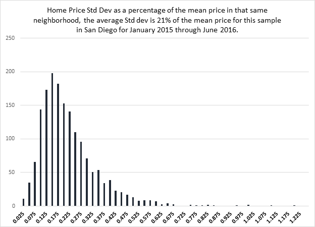
We should expect price dispersion to vary for different neighborhoods based on their homogeneity over a variety of attributes. Below we observe the distributions for hundreds of neighborhoods and later we will explore what is normal for the US and provide some illustrations for average neighborhoods, relatively lower priced and higher priced.
Exhibit 2: San Diego Neighborhood Quartile Distributions from Exhibit 1
| Quartile of Homogeneity | Standard Deviation as % of Mean Price in Neighborhood |
| Top 25% | 12.5% |
| Next 25% | 17.5% |
| Next 25% | 27.0% |
| Bottom 25% (Most heterogeneous) | 34.0% |
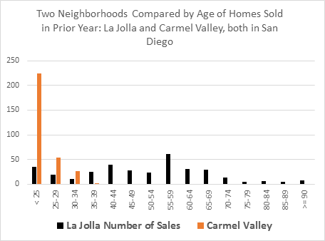
One of the most telling attributes for measuring homogeneity is age. Here in Exhibit 3 we compare the age of two nearby neighborhoods, one fairly new, Carmel Valley and one much older, La Jolla, both in San Diego. The mean ages are different but the greater variance of the La Jolla homes compared to Carmel Valley is obvious.
Exhibit 3: Age of Homes
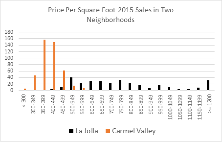
Using Exhibit 3 as an indicator of possible price dispersion, observe the prices per square foot for these same two neighborhoods expressed in dollar terms in Exhibit 4. Which one is the greater challenge for appraisers? It is obviously the older and more diverse housing neighborhood. In such diverse neighborhoods finding similar comparable property will be more of a challenge and therefore accurate appraisals will also be more difficult.
Exhibit 4: Price Per Square Foot for Neighborhoods in Exhibit 3
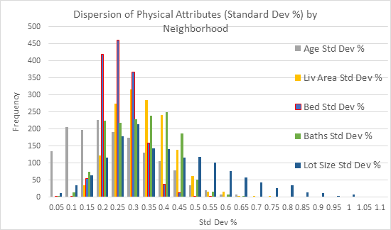
Several physical attributes can be used in combination or alone to describe the heterogeneity of a neighborhood. Generally, the degree of heterogeneity is correlated among several variables. That is, neighborhoods with greater dispersion by age also will have more dispersion by living area, number of bedrooms or baths or lot sizes. Below the frequency distributions are compared across several physical attributes for over 1500 neighborhoods. The dispersion of age is less than for other attributes as it is skewed further left. Lot size is skewed more to the right with a longer tail. In terms of which variables work best solo as a measure of homogeneity; age and age dispersion seem to hold the most promise. A preliminary test of price dispersion is described below along with some indications of neighborhood traits impacting foreclosure rates.
Exhibit 5: Comparing the Distribution of Standard Deviations of Physical Attributes by Neighborhood
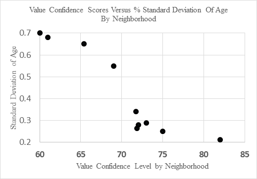
Physical attribute heterogeneity within a neighborhood are an indication of valuation uncertainty. Below in Exhibit 6 we have a sample of neighborhoods from Cincinnati, where average age varied from 18 years to 93 years, selected for a diversity of ages. Here the value confidence score is based on the estimate of value and being within 10% of the true value. What becomes apparent is that the less age dispersion in a given neighborhood, the lower will be appraisal error. It is simply harder to compare properties when ages vary and the condition of the interior is not always known. It is also generally harder to value older properties in the same neighborhood for the same reason. The condition of the interiors of comparable property used for valuation modeling is less certain.
Exhibit 6: Percentage Standard Deviation of Age Versus Valuation Confidence Range for a Sample of Neighborhoods in Cincinnati
What Drives Neighborhood AVM Confidence Levels?
In a more formal test of AVM confidence scores by neighborhood, we found that turnover, age and age dispersion were all significant predictors of the forecast standard deviation of the value estimate and therefore of the confidence level. Turnover rate is an indicator of liquidity, measured by the number of homes selling each year as a percentage of the total stock. Age and age dispersion capture much of the physical heterogeneity. For a sample of nearly 11,000 neighborhoods we find the following results on a model with an adjusted R Squared of .363:
Dependent Variable: Average Confidence Score Grouped by Neighborhood
Independent Variable Coefficient T-Stat P>(t)
Turnover Rate 1.0383 3.60 .000
Age Mean -.1582 -76.82 .000
Age Dispersion -5.516 -28.86 .000
Cons 93.607 705.88 .000
We observe above that confidence scores vary positively with more turnover and negatively with higher average age and higher average age dispersion. The older the property the more likely we would find more variability in terms of property conditions as some properties have been maintained better than others. The greater the age dispersion the more variability we observe in general. One could interpret this as an indication of appraisal difficulty. Older neighborhoods or those built at different times and neighborhoods with less turnover are more challenging to value.
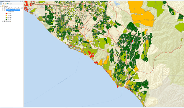
In the Appendix we show some spatial maps of San Diego, Orange County and the Bay Area that provide average neighborhood confidence scores. See A-13, A-14 and A-15 respectively. Note that unique and expensive neighborhoods filled with older custom homes tend to have the lowest confidence scores while more homogeneous neighborhoods with more turnover and less distress tend to have the highest scores.
More Formal Tests Explaining Neighborhood Price Dispersion with the Addition of Debt Stress Indicators
For 5419 neighborhoods we ran price dispersion, as measured by the standard deviation of price as the dependent variable against the following variables, with very significant results for most of the variables shown. The overall Adjusted R square is .377. Price dispersion is positively related to age dispersion and living area dispersion and higher use of debt reflected in higher LTVs. Price dispersion is negatively related to bedroom and bathroom dispersion, the use of second mortgages and the percent of homes with LTV above 90% and foreclosure rates. The use of 90% and higher mortgages is correlated with price and representative of the lower priced range neighborhoods. The use of second mortgages is more typical of homes with low first mortgage LTVs but not very common in 2016.
Dependent Variable: Price dispersion
Independent Variable Coefficient T-Stat P>(t)
Age dispersion .0384 3.83 .000
Baths dispersion .3148 9.32 .000
Bed dispersion -.3070 -7.01 .000
Living area dispersion 1.1221 27.44 .000
Avg LTV 1.3565 21.69 .000
Pct LTV>90 -.4895 -21.63 .000
Pct_w_2nd Mtge -.1250 -2.34 .019
Foreclosure Rate -.0206 -4.69 .000
To standardize and control for size, and to some extent price range, the same variables and neighborhoods were tested against the price dispersion observed per square foot, with the following results. The overall adjusted R Square is .2922. Now the coefficients results are as follows, with bedrooms falling out as insignificant. Not only do physical elements help explain price dispersion but leverage also seems to matter a great deal. This is an interesting result in that leverage is not a physical attribute, yet it is correlated with greater neighborhood price dispersion even when controlling for size.
Independent Variable Coefficient T-Stat P>(t)
Age dispersion .0214 2.25 .025
Baths dispersion .4931 15.33 .000
Bed dispersion .0107 .26 .798
Living area dispersion .2512 6.43 .000
Avg LTV 1.6425 27.57 .000
Pct LTV>90 -.5704 -26.47 .000
Pct_w_2nd Mtge -.1223 -2.42 .016
Foreclosure Rate -.0084 2.12 .034
Constant -1.132 -24.45 .000
Liquidity Risk Illustrations
Note that in Exhibit 7 below, the sweet spot in terms of liquidity seems to be similar in the $1.2 million price range for these high end neighborhoods, but at the lower end of the market in these neighborhoods we observe that homes below $600,000 are much less liquid in one neighborhood versus the other. In general, cheaper homes sell fast but there are exceptions, such as when such homes are atypical for the neighborhood and most of the value is simply land.
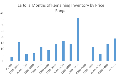
Also note that this data is for homes that have sold. A better indicator of liquidity risk might be the Months of Remaining Inventory. In Exhibit 8 we show this for Carmel Valley. We see the Y axis only going to 20 months while in La Jolla (Exhibit 9) it goes to 40 months, or over three years. The time to sell a property in La Jolla is likely to be much longer even though the time on the market statistics do not look that different. Some unique homes take much longer to sell and in the $4 million to $4.2 million price range it might take three years to unload a property not deeply discounted.
Exhibit 7: Time on the Market by Selected Neighborhood

Exhibit 8: Months Remaining Inventory in Carmel Valley
Exhibit 9: Months Remaining Inventory in La Jolla
Time on the market and months remaining inventory are important indicators of neighborhood liquidity risk, should a lender need to foreclose and sell a home. These statistics do vary a great deal by neighborhood and price range within a neighborhood but can be analyzed and incorporated into liquidity risk considerations ahead of time. To sell a home quickly, in say 30 to 60 days, in a neighborhood where 210 days is more typical will require a larger price discount than selling in a neighborhood where 120 days is typical or where there is less than 3 months of inventory typically on the market.
Default Risks by Neighborhood
Loan to value ratios matter in terms of default rates. There is an extensive literature on “strategic” or “rational default”. See for example, Guiso, Sapienza and Zingales (2013). The less equity the homeowners thinks they have the more likely they will walk away from a mortgage. But loan to value ratios, to be correctly calculated require some confidence in the valuation of the property.[6] There is also extensive literature on the stigma and propensity to default based on your neighbors (See M. Seiler ) and the contagion effect ( See Towe and Lawley, 2013 or Rauterkaus, Miller, Thrall and Sklarz 2010).
Here we analyzed over 5400 neighborhoods over the past year for their propensity to observe foreclosures as a function of the attributes of the neighborhood. While age is correlated with more foreclosure it is not very significant. The dispersion of living area in each neighborhood is also slightly positively related to foreclosure, but it should be no surprise that the most significant impact on foreclosure is the average LTV of the neighborhood. Each percent of higher average LTV for neighborhood results in 2.23 times the average foreclosure rate. Second mortgages, perhaps because they are so sparse in 2016 did not impact foreclosure rates. Price dispersion, based on price per square foot, was fairly significant and correlated with foreclosure suggesting that neighborhoods with greater price dispersion also tended to be riskier for mortgage lenders. The overall adjusted R square was quite low at .034.
Dependent Variable: Foreclosure Rate
Independent Variable Coefficient T-Stat P>(t)
Age dispersion -.0456 -1.39 .163
Baths dispersion .0404 .36 .720
Bed dispersion .1026 .71 .476
Living area dispersion -.0242 -.18 .857
Avg LTV 2.2309 10.33 .000
Pct LTV>90 -.4615 -5.90 .000
Pct_w_2nd Mtge .0487 .28 .779
PricePSF dispersion .0989 2.12 .034
Constant -1.667 -10.06 .000
We repeated the regression above without a constant, and got the following results. It seems that the sign on the percentage of loans in a neighborhood with 90% or higher LTV flipped and now suggests a higher foreclosure rate. The overall adjusted R square increased slightly to .067. At the same time, price dispersion shows up as more significant this time as an indicator of foreclosure rates along with average LTV and the percentage of loans with LTVs above 90%. Second mortgages do not seem to matter but were scarce in this data set.
Dependent Variable: Foreclosure Rate without a constant
Independent Variable Coefficient T-Stat P>(t)
Age dispersion -.0837 -2.25 .011
Baths dispersion .2326 2.08 .038
Bed dispersion -.1403 -.98 .327
Living area dispersion -.3651 -2.78 .005
Avg LTV .1296 2.36 .018
Pct LTV>90 .1293 2.48 .013
Pct_w_2nd Mtge .0188 .11 .914
PricePSF dispersion .2502 5.62 .000
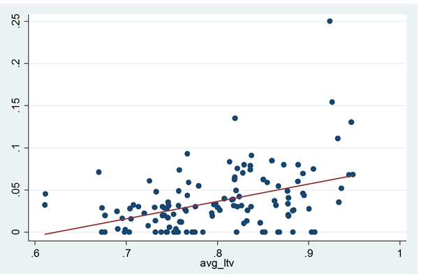
Below in Exhibit 10 we show foreclosure rates versus average LTVs in all the San Diego neighborhoods with both a linear fitted line and a curvilinear fitted line. It appears that the LTV of the neighborhood matters in explaining foreclosure rates. Neighborhoods with average LTVs above 90% appear to be significantly riskier than those where the average LTVs are below 80%.
Exhibit 10: Foreclosure Rates in San Diego by Average LTV of Neighborhood with Linear and Polynomial Fitted Lines
Visualizations of Neighborhood Attributes
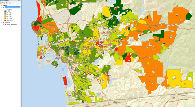
Below in Exhibit 11 we show the average living area by neighborhood with color coding. Some neighborhoods are larger than others in less dense neighborhoods, but we observe small units in both the expensive per square foot inner city and in the least expensive suburban markets with small homes. The dark green are large homes and the orange or red are the smallest. Compare this to Exhibit 11 which shows the variance of the living area in percentage terms.
Exhibit 11: San Diego Neighborhoods by Average Size of Living Area
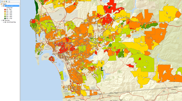
Exhibit 12: San Diego Neighborhoods Standard Deviation of Size of Living Area
Here the orange color shows the greatest variation of size and the dark green represents the most homogeneous neighborhoods by size. Naturally the lowest the variation in size the easier it is to appraise in such neighborhoods, especially when the ages are similar.
Exhibits 11 and 12 are combined below in Exhibit 13. In which neighborhoods can higher confidence valuation occur? Below in Exhibit 12 we show the average coefficient of variation of the standard deviation of size over the average size of living area. Those neighborhoods with the dark green are the easiest to appraise as they are the least complex. Those neighborhoods with red or orange are the most complex showing the highest degree of variation.
Exhibit 13: San Diego Percentage Variation of Size by Neighborhood
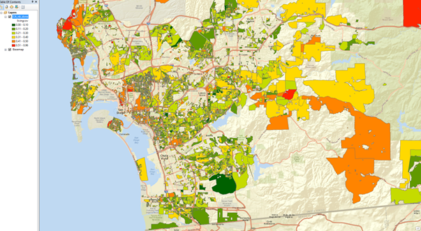
Exhibit 14: San Diego Average Loan to Value of Mortgages by Neighborhood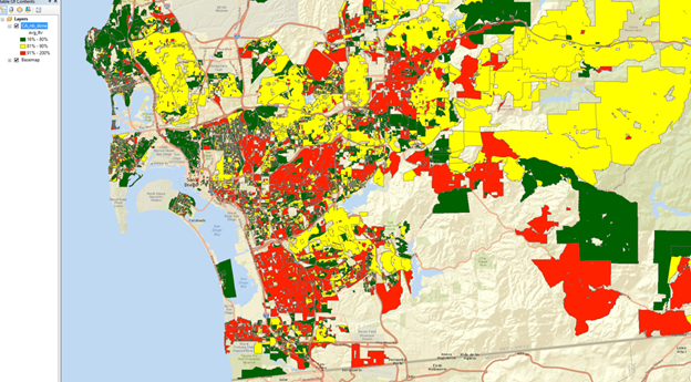
Below we use only three simple groups for the average LTV as of June 2016, the dark green dots represent LTVs of 10% to 80%, the yellow dots represent 80% to 90% LTV and the red dots represent those neighborhoods where the LTV remains above 90%. Here clear patterns are obvious.
Conclusions
Neighborhoods can be analyzed from the perspective of complexity or heterogeneity. Neighborhoods with more percentage variation by age or size tend to be more difficult to value. Neighborhoods also exhibit patterns with respect to the average time required to liquidate property should that be necessary and these patterns systematically vary by neighborhood and price levels within each neighborhood. Last, foreclosure rates tend to be higher in neighborhoods with a propensity for more debt as a percentage of value, and the literature suggests that contagion is a real risk. It is not just the loan to value ratio of an individual household that matters but the neighbors as well, in any thorough analysis of risk.
References
Harding, John P. Eric Rosenblatt, and Vincent Yao, 2009, The Contagion Effect of Foreclosed Properties, Journal of Urban Economics, 22:3, pp 164-178
Haurin, Donald, 1988, “The Duration of Marketing Time of Residential Housing” AREUEA Journal, 16: 4 pp. 396-410.
Towe, Charles and Chad Lawley, The Contagion Effect of Neighboring Foreclosures” (2013) American Economic Journal, 5:2, pp. 313-335.
Rauterkus, Stephanie, Norm Miller, Grant Thrall and Michael Sklarz, 2010, “Foreclosure Contagion and REO Versus Non-REO Sales” International Real Estate Review 15:3, pp. 307-324.
Miller, Norman G. and Michael Sklarz, 2013, Integrating Real Estate Market Conditions Into Home Price Forecasting Systems” Journal of Housing Research, 21:2. pp. 183-214.
Guiso, L., P. Sapienza and L. Zingales, “The Determinants of Attitudes Toward Strategic Default on Mortgages” 2013, Journal of Finance, 68: 4, pp. 1473–1515
Appendix
What is normal for the distributions of prices and physical attributes in the United States. Below is a set of Exhibits depicting several physical attributes for US homes. The data and analysis here is by Collateral Analytics.
Exhibit A-1 Median Sold Prices as of June 2016
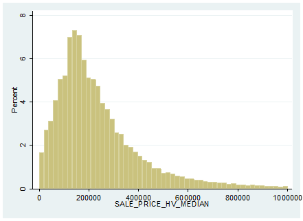
Exhibit A-2: US Median Neighborhood Price/Living Area in Square Feet as of June 2016
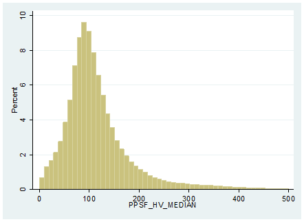
Exhibit A-3: US Neighborhood Mean Living Area Size in Square Feet as of June 2016
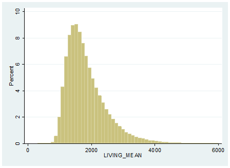
Exhibit A-4: US Neighborhood Mean Bedroom Count Distribution
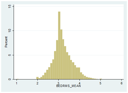
Exhibit A-5 US Neighborhood Mean Bath Count Distribution

Exhibit A-6: US Neighborhood Mean Lot Area Distribution in Square Feet
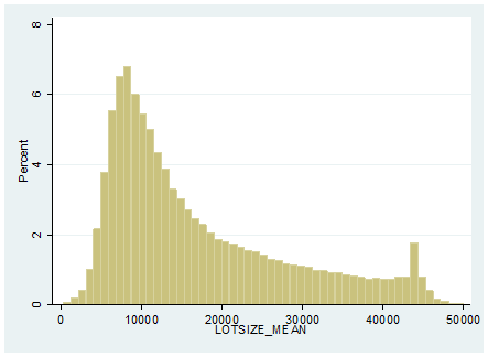
Exhibit A-7: US Neighborhood Age (From Year Built) Distribution as of June 2016
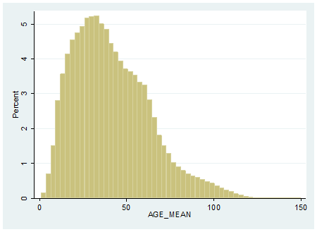
Exhibit A-8: US Single Family Home Distribution of Average LTV as of June 2016 for those with Mortgages based on current valuations
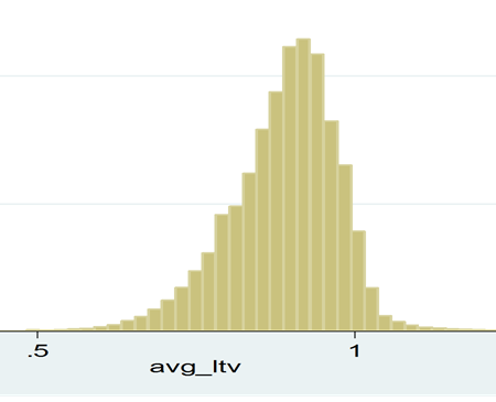
Exhibit A-9: US Neighborhoods Percentage of Homes with 90% or higher LTVs as of June 2016
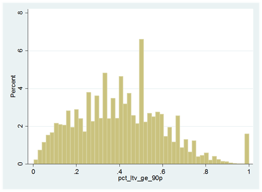
Exhibit A-10: US Neighborhood Percentage of Homes with a Second Mortgage as of June 2016
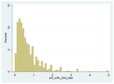
Exhibit A-11: US Single Family Property Condition Distribution as of June 2016
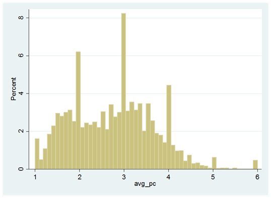
Exhibit A-12: US Homes with Property Condition of 5 or 6 as of June 2016
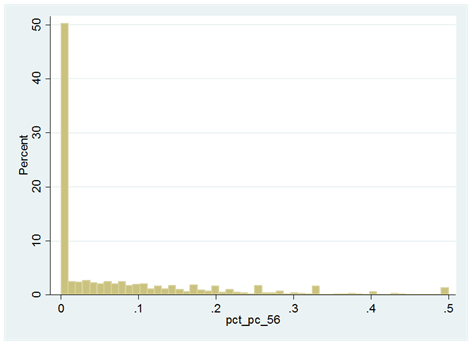
Exhibit A-13: Average CA Value AVM Confidence Scores in 2016 by Neighborhood for San Diego
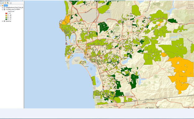
Darker green areas are those with high confidence, above 90%, light green areas are 81% to 90% and light orange is 71-80%, while red is below 70%
Exhibit A-14: Average CA Value AVM Confidence Scores in 2016 by Neighborhood for Orange County
Darker green areas are those with high confidence, above 90%, light green areas are 81% to 90% and light orange is 71-80%, while red is below 70%
Exhibit A-15: Average CA Value AVM Confidence Scores in 2016 by Neighborhood for the Bay Area
Darker green areas are those with high confidence, above 90%, light green areas are 81% to 90% and light orange is 71-80%, while red is below 70%
Download a PDF file of this research paper here.
[1] See p. 17 of Real Estate Principles for the New Economy by Miller and Geltner, Cengage publishers, 2005 for an expanded discussion. The subject property is the one under analysis.
[2] Collateral analytics has defined over 400,000 distinct residential neighborhoods. This compares to 43,000 5 digit zip codes not all with residential homes. There are on average 5 to 15 neighborhoods per ZIP Code.
[3] See Haurin, 1988 at abstract. “The Duration of Marketing Time of Residential Housing” AREUEA Journal, 16: 4 pp. 396-410.
[4] John P. Harding, Eric Rosenblatt, and Vincent Yao, 2009, The Contagion Effect of Foreclosed Properties, Journal of Urban Economics, 22:3, pp 164-178
[5] See “Did Dubious Mortgage Origination Practices Distort House Prices?” by John M. Griffin and Gonzalo Maturana, 2016 (January 22) in The Review of Financial Studies.
[6] That is the subject of another paper by Sklarz and Miller. See http://collateralanalytics.com/adjusting-loan-to-value-ltv-ratios-to-reflect-value-uncertainty/