The primary theme of the 2013 residential real estate market has been very tight conditions due to the lack of available inventory for sale. This is quite ironic when considering that a year ago, many housing market analysts were predicting that the huge supply of REO and so-called “shadow inventory” properties would keep the real estate market depressed for many years.
This shortage of inventory has led to buyers bidding against one another for those homes that are listed for sale, resulting in significant home price increases in many markets. In fact, there have been numerous anecdotal stories of multiple offers being received on homes shortly after being listed, with potential buyers offering significant premiums to the listing prices. Unfortunately, there is no way to confirm this with available data but a good proxy for this phenomenon is a commonly followed metric that is the ratio of the sold price to the listing price (Sold-to-List Price Ratio). Depending on the particular market, this indicator typically fluctuates between about 92 percent and 98 percent but in very hot markets it can exceed 100 percent. This is also one of the important leading indicators that we follow for both macro and micro real estate markets.
Figure 1 below shows a long-term chart of the Honolulu CBSA Sold-to-List Price Ratio and the annual percent change in the median condominium sold price. As seen, this indicator has historically led the home price by approximately six months over the past three real estate cycles and its turning points have been excellent signals for the same in condo prices.
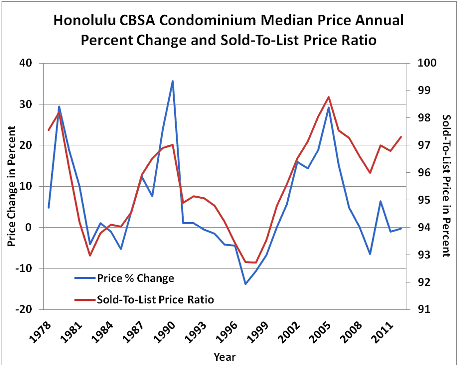
Figure 1: Honolulu CBSA Condominium Median Price Annual Percent Change and Sold-to-List Price Ratio
Figure 2 below shows quarterly values back to 1994 for the Tucson AZ single family market. Here the Sold-to-List Price Ratio leads by one to two quarters and the two series have been highly correlated with one another. As seen, during the peak of the bubble period in 2006, the Sold-to-List Price Ratio exceeded 100 percent, that was indicative of a very frenzied market.
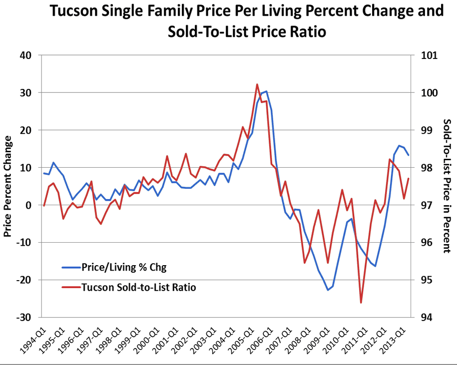
Figure 2: Tucson Single Family Price Per Living Percent Change and Sold-to-List Price Ratio
Since this indicator moves directly with the market itself, it is a very useful tool for gauging market conditions with values analogous to what it would be like if we could take the market’s temperature.
The San Francisco Bay area has been particularly hot in the past year in all its constituent CBSAs. There have been numerous stories of “bidding wars” between potential buyers and homes being sold above listing price as soon as they come on the market. Figure 3 shows a thematic map of the most recent Sold-To-List Price Ratio by ZIP code. The red colors correspond to the hotter ZIP codes based on this indicator. Not surprisingly, most have been close to or above the 100 percent level since the third quarter of last year.

Figure 3: San Francisco – Sold-to-List Price Ratios
In contrast, as seen in Figure 4, markets such as Chicago are currently exhibiting more typical Sold-to-List Price Ratios and, thus, more normal conditions. The List-to-Sold Price Ratio will be a useful indicator to monitor over the coming year as a signal that some of these markets transition to more heated conditions.

Figure 4: Chicago – Sold-to-List Price Ratios CBSA Winners and Losers
Each month Collateral Analytics ranks the single family home markets in the top 200 CBSAs to highlight the best and worst metros with regard to a number of leading real estate market based indicators.
The ranking system is purely objective and is based on directional trends. Each indicator is given a score based on whether the trend is positive, negative, or neutral for that series. For example, a declining trend in active listings would be positive as will be an increasing trend in average price. A composite score for each CBSA is calculated by summing the directional scores of each of its indicators. From the universe of the top 200 CBSAs, we highlight each month the CBSAs that have the highest and lowest composite scores.
The tables below show the individual market indicators that are being used to rank the CBSAs along with the most recent values and the percent changes. We have color-coded each of the indicators to help visualize whether it is moving in a positive (green) or negative (red) direction.
Top 10 CBSAs
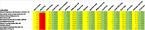
The top ranked metros in the current month include markets from all major regions of the U.S. Of particular note is that two of the top markets are in Nevada and include not only the widely followed Las Vegas-Paradise NV CBSA, but also, the Reno-Sparks NV metro, both of which had previously been very distressed having experienced severe price declines after their respective market peaks in 2005 and 2006. California continues to be well represented in this list by the Los Angeles, Oakland, and Sacramento metros. A new entrant to the Top 10 list this month is the Nashville TN CBSA, which actually had the highest score based on our collection of market indicators. This is a market that had a more shallow correction than many of the hard hit markets in the recent recession and also appears to be experiencing improving overall economic conditions. This metro has always been one of the most affordable in the U.S. and, as seen in Figure 5, is currently exhibiting its highest readings in 30 years.

Figure 5: Affordability Index – Nashville Single Family
An interesting development that we have highlighted in recent months is that several of the previously top markets from late last year are no longer in the list because their year-over-year sales counts are down sharply. However, the reason for this is that sales are being constrained by a lack of inventory rather than a decrease in demand. With the exception of the Nashville CBSA, this phenomenon is also showing up in our Top 10 list. Note that all these metros are exhibiting positive trends in all the important market indicators except sales activity. Because their active listing counts are also down sharply, the Months of Inventory Remaining values are still quite low.
Bottom 10 CBSAs
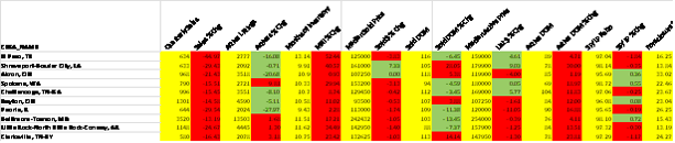
The bottom ranked metros also represent and interesting mix of markets around the country. As seen in the table, all have nine to thirteen Months of Remaining Inventory. However, our top and bottom ranked CBSAs are ranked on a relative basis. Thus, even the ones in the Bottom 10 list are showing a fair percentage of positive (green) trends. A common characteristic of all these is that they are relatively smaller markets based on both population size and sales activity. This is quite different from last year when the majority of the Bottom 10 markets had most (or all) of their indicators trending negative and colored red.
Outliers
In this month’s Outliers, we highlight the Las Vegas-Paradise, NV CBSA, which is currently in the list of the Top 10 metros. As seen in the ranking table above, all but one of the important market indicators for this CBSA are showing positive trends on a year-over-year basis including declining inventory, lower Months of Remaining Inventory, declining market times and lower distressed sales activity to name a few.
Within this CBSA there are numerous sub-markets. On a ZIP code level, one of particular interest is Las Vegas ZIP code 89135, which is one of its higher priced markets.

Figure 6: CBSA – Las Vegas-Paradise | ZIP 89135, Las Vegas, NV
As seen in Figure 6, single family home prices in this ZIP code held up somewhat better that the overall Las Vegas metro since the market peak. More important, as seen above, our home price forecast models call for this ZIP code to continue to outperform the surrounding metro and move closer to its previous peak levels over the next several years.
There are a number of reasons for the historical and forecasted outperformance of this ZIP code that include the fact that homebuyers in this ZIP code have historically been better capitalized and, thus, better able to weather declines in home prices. The average loan-to-value (LTV) ratio in ZIP 89135 has historically been between 75 and 80 percent compared to approximately 85 to 90 percent for the overall Las Vegas-Paradise, NV CBSA.