By James R. Follain, Norman Miller, and Michael Sklarz
A critical issue in today’s housing market concerns both the size of the distressed real estate inventory and the speed at which it will dissolve. The faster the transition from distressed to nondistressed, the faster will be the full recovery of the housing market. Attention in this article is focused on the transition from what we have previously labeled as Stage 1 of distress — properties with negative equity — to the various states or outcomes to which they transition. One of these paths is entry into the foreclosure or REO inventory of properties owned by the financial institutions who conduct the foreclosures.
Detailed data at the property level compiled by Collateral Analytics for three zip codes in CT, NJ, and NY are analyzed to shed light on the time it takes for this transition to occur and the role of a key driver of this decision – the current loan to value ratio based on a newly estimated market value The analysis highlights the enormous potential of these data to guide business and public policy decisions to reduce the size of regarding the amelioration of the inventory of distressed real estate. One especially important aspect of the analysis here is the ability to track the current loan to value ratio at the property level from the time the property first enters the inventory of properties with negative equity until it departs. Indeed, evidence is presented to demonstrate that the current LTV is a key driver of the transition from negative equity to foreclosure. In keeping with ongoing themes of our previous articles in the Lessons from the Data series, we once again offer strong evidence of variability in these transition processes among local housing markets. For example, the process is much slower in New York than in the two neighboring states.
Background
A conference was held at the NY FRB on October 5th 2012 entitled “Distressed Residential Real Estate: Dimensions, Impacts, and Remedies”. The first two presentations focused on the measurement of the size of the distressed real estate inventory and the transitions from one stage to another. Dr. Richard Peach offered nationwide estimates of various stages of the distressed inventory using mortgage servicing data: about 1.3 million loans are 90+ days delinquent, about 1.5 million are in the foreclosure process, and about 450,000 properties are in the foreclosure or REO inventory. Dr. James Follain used public records based data compiled by Collateral Analytics to offer measures of the number of properties with negative equity and the size of the foreclosure (REO) inventory for a variety of mostly large counties and zip codes within the three state area inside the NY FRB District: CT, NJ, and NY. Both presentations confirmed the wide geographic variability in these various measures. They also offered estimates and highlighted some of the challenges associated with forecasting the transitions of distressed real estate from one stage to another.[1]
A striking example of such a challenge involves the transition from negative equity to foreclosure. CA data used in Follain’s presentation showed that the inventory with negative equity was much larger than the foreclosure inventory in this three state area. For example, there were about 800,000 single family residential (SFR) properties in the counties studied versus about 20,000 in the foreclosure inventory. Though the ratio of those with negative equity to those in the foreclosure inventory varies widely among the counties, the huge gap between these two stages was evident in all counties studied. One possibility raised by this gap is that the foreclosure inventory may not yet have peaked in these areas if a substantial number of the properties with negative equity transition to the foreclosure inventory.
The purpose of this article is to discuss and offer evidence about the transition processes from negative equity. It utilizes a unique data set constructed by Collateral Analytics. These data follow SFR properties from the time they first enter the negative equity inventory until they move to one of several other possibilities. This is done by assigning Collateral Analytics AVM estimates to each property every three months and keeping track of the initial mortgage amount plus any new additions to debt. The data also carefully tracks a wide variety of outcomes or ways in which a property can transition from negative equity. These outcomes include entry into the foreclosure process, a short sale, a regular sale, and the largest single outcome – No change.
Survival Models
The generic approach needed to study these various transitions builds upon the best econometric practices used to measure mortgage performance for many years. These methods have their roots in medical studies of various treatments for people with illnesses of one type or another. These are labeled “survival” models because they track individual patients from the time of the first treatment until sample period ends. Outcomes are measured by whether the patient survives or is cured and the results are designed to shed light on the duration of the treatment period and, for example, the size and frequency of the medications used by the patients to treat the illness. Such an approach recognizes that the measurement of these transition processes greatly benefits from a close tracking of the circumstances associated with the property at the time of entry into the inventory until its exit. For example, the effectiveness of any treatment upon a target population depends upon certain health traits of the patients at the start of the treatment period.
These methods have been used for over two decades to study the performance of mortgages. The emphasis is usually placed upon whether the mortgage ends in default, prepayment, or continues to survive. The traditional models of mortgage performance use information about each mortgage at the time of origination, such as the initial interest rate and the initial loan to value ratio, and track changes in these key variables over the life of the mortgage. The ultimate goal is to predict the probability of the three outcomes using models of behavior as well as projections of the key variables that drive mortgage performance.
We utilize the same basic approach to study the transition of properties with negative equity until they exit the inventory or the end of our period of observation is reached. As such, data for each property begin with measures of the property value and initial loan to value ratio in the quarter in which the property is first determined to have negative equity. The last observation for each property includes an indicator of the type of exit outcome, measures of the property value and the current loan to value ratio, and a measure of how long the property has been in the inventory, which is often referred to as “duration”. This approach is likely to better predict changes in the inventory over time relative to an approach that focuses only upon changes in the aggregate number of properties in this inventory from quarter to quarter because it takes better account of the widely varying circumstances and durations associated with properties within the inventory. The results of a case study of our approach for three zip codes in the three state area are discussed below: Fairfield, CT 06604: Union, NJ 07206; and Nassau, NY 11550.
Data and Key Results
The sample used for this exercise consists of 5,021 properties which entered the negative equity inventory between April 2005 and July 2012. A property enters this inventory if the value of the property is less than 95 percent of the outstanding mortgage balance on the property. These properties are tracked each quarter, which generates a data set with over 73,000 quarterly observations on the 5,021 properties. The peak year for entry into this inventory was 2009 when 25 percent of these properties first had evidence of negative equity. Most of the others entered this inventory for the first time in 2007-2008 and 2010-2011. The median duration a property remained in this inventory before exiting was three years and over twenty percent were in this inventory for more than five years. The average initial AVM estimate for these properties was about $270,000, but these values declined by an average of more than 25 percent while in the inventory.
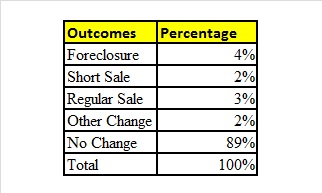
The distribution of the various outcomes for these 5,021 properties looks like this:
Four percent exit via foreclosure. 5 percent exit via a short or regular sale. 2 percent exit by other miscellaneous means. 89 percent experience none of these changes and still remain within the inventory of properties with negative equity at the end of our observation period, July 2012.
What we seek to learn from this sample is something about the circumstances or conditions that affect the length of time in this phase of distress and the likelihood of one of the outcomes. A variety of complex econometric methods are available to study this question. Here we focus upon one version designed to estimate the likelihood or probability of a foreclosure outcome among these 5,021 properties. The key drivers of this outcome include the duration of time in the negative inventory, the current loan to value ratio of the property in the last month within the sample, and some other relatively control variables included in the estimation. Here are a few figures that highlight some key findings.
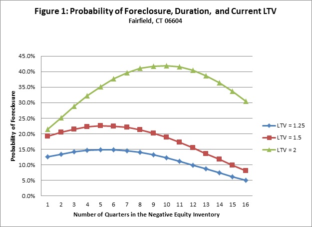
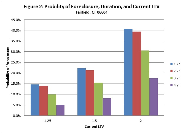
First, the likelihood of foreclosure peaks during the second or third year within in the inventory. This is captured in Figure 1, which plots the predicted foreclosure rate for various durations and three different loan to value ratios for a typical property in the Fairfield, CT 6604. For example, the predicted foreclosure rate for a property that has been in the inventory for 10 quarters and has a current LTV of 150 percent is 22 percent. Those with a higher LTV have a higher predicted foreclosure rate and those with a lower LTV have a lower predicted foreclosure rate. Those with the highest LTV of 2 reach their peak foreclosure rate of a little over 40 percent in the third year or in quarter 10; the other two lower LTV categories reach their peak foreclosure rates in year 2 or quarter 6. The same patterns are captured in Figure 2, which shows the probability of foreclosure for specific combinations of duration and current LTV.
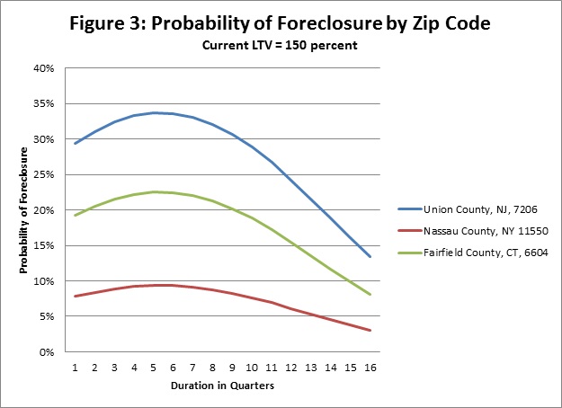
Second, there are both similarities and differences in these relationships among the three zip codes. Figure 3 seeks to depict the same relationship between the probability of foreclosure and the duration of the time the property is in the negative equity inventory as is done in Figure 1 for each of the three zip codes. These three curves show the probability of foreclosure as a function of the duration that the property has negative equity; this relies upon a current LTV of 150 percent. The differences among the three zip codes arise from a technical perspective because the estimated model assigns a different intercept or fixed effect to each zip code. They all show a similar humped back relationship, though the magnitudes of the predicted foreclosure rates differ markedly among the three zips. They are much higher for Union County, NJ 07206 and much lower in Nassau County, NY 11550.
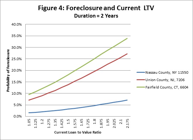
Another look at the differences among the zip codes is obtained by focusing on the relationship between the probability of foreclosure and the current LTV ratio for a given duration of two years or eight quarters. These results are plotted in Figure 4 and suggest a much stronger relationship between the current LTV and the probability of foreclosure in the CT and NJ zip codes than in the NY zip code. Indeed, the relationship between the predicted foreclosure rate and the current LTV is nearly flat in NY zip as well as being much lower than in the other two.
A challenging issue involves offering explanations for these interstate differences. One obvious possibility in this type of analysis is to consider state foreclosure laws; however, the laws are quite similar on key issues in these three states. They are all judicial foreclosure states and all allow for deficiency judgments against other borrower assets in the case of foreclosure. On the other hand, there have been changes and modifications in these laws and policies to implement them in recent years that may affect the transition to foreclosure. For example, settlement conferences to promote modifications were instituted in New York in 2008 legislation for subprime borrowers and in 2009 for all owner-occupied housing. Perhaps these are allowing households a longer time to pursue the modification option.
One other possible explanation for these results may relate to the years and the circumstances in which these various properties entered the inventory. In fact, over 1000 properties entered the inventory in 2009 in the NY zip versus only 200 in the other two zips. The 1000 or so properties in NY have experienced an average decline in their value of more than 30 percent since that time versus 16 percent in the New Jersey zip and 1 percent in the Connecticut zip. The average prices of the homes in the NY zip were also substantially higher than in the other two zip codes at that time: the average price of a home was $320,000 in the NY zip versus $190,000 in the other two zips. Perhaps the higher price properties are associated with higher income and wealth borrowers who face a higher risk of a deficiency judgment than in the other zip codes.
Next steps
We view this article as a case study to highlight the potential value of applying survival models to the study of the transition from negative equity to the REO inventory. Our focus is upon three zip codes in three states. The results suggest the power of the approach to offer estimates of the duration or time this transition process takes. It also captures important differences among these three states.
Of course, the results in this article say little about other zip codes in these states or, more importantly, the transition processes in other states. The good news is that detailed data are available to study the transition processes in other areas within these three states and in other states, where foreclosure law differences may be more pronounced. A key ingredient of the approach is the measurement of the current LTV over time at the property level. Another is the identification of an array of outcomes other than foreclosure such as the short sale. Indeed, application of these data to these three zip codes suggests a couple of important findings: the transition from negative equity to foreclosure seems to peak at around 6 quarters and higher current LTVs lead to higher foreclosure rates, all else equal. The less good news is the ongoing challenge of incorporating differences among local or state conditions into the model. Our results confirm that foreclosure is less likely in the NY zip code than the other two, but assigning a definitive explanation is difficult at this time.
We plan to continue to study these transition rates and other transition rates using this survival model approach. One effort will seek to examine these duration based models for more places around the country. This might help to better identify the drivers of variations among states due to foreclosure laws. We will also study the transition from the foreclosure inventory via REO sales of properties back to the regular or non-distressed market. Both of these might seek to incorporate more information about the neighborhoods of the properties to see whether entry to or exit from foreclosure is linked to the behavior for nearby properties. Another possibility is what many call strategic default; that is, there are some folks who have negative equity and await some additional stimulus to lessen the great pain associated with foreclosure. We will close with an upbeat possibility: perhaps those borrowers with substantial negative equity can see a brighter day with higher prices on the horizon and, if right, postponing default and foreclosure for a little longer may be prudent. Let’s hope they are right!
[1] The agenda and Follain’s presentation can be accessed at: http://www.rockinst.org/forumsandevents/.
